
Media used: acrylic on canvas.
Although I have not yet seen it in person, this painting is based on images I have seen of Delicate Arch, in Utah’s Arches National Park.
Media used: acrylic on canvas.
Although I have not yet seen it in person, this painting is based on images I have seen of Delicate Arch, in Utah’s Arches National Park.

The tragedy of modern American history: we fought our bloodiest war to date, and ended slavery, in the 1860s. Race, a difficult issue in the USA, to say the least, could have started to become less of an issue — at that point.
But . . . this didn’t happen. Instead, the “Jim Crow” era began, and, as a nation, we foolishly let it run for roughly another century before fixing that, and even then, we’ve left large parts of this problem unfixed, to this day — such as the problems that underlie high-profile police-brutality cases, which usually involve Black men being clobbered, to, or near, the point of death — by alleged “public servants,” who do a great disservice to the actual men and women of honor (yes, they do exist) who wear police uniforms. It is the fault of these “criminal cops” that police officers are not widely trusted, nor liked, in many African American communities.
All this, and Americans actually wonder why such things as an academic achievement gap still exist? Hint: DNA has absolutely nothing to do with it. The cause of this “gap” is easy to see: entrenched, pervasive racism, and the perfectly-understandable reaction to it, from a population with every reason to be utterly sick of being treated as less than fully human.
It’s 2015: well into the 21st Century. This situation is both absurd, and shameful.
This is a real ad. Except from cropping away the rest of the webpage where I found it, I did not alter it.
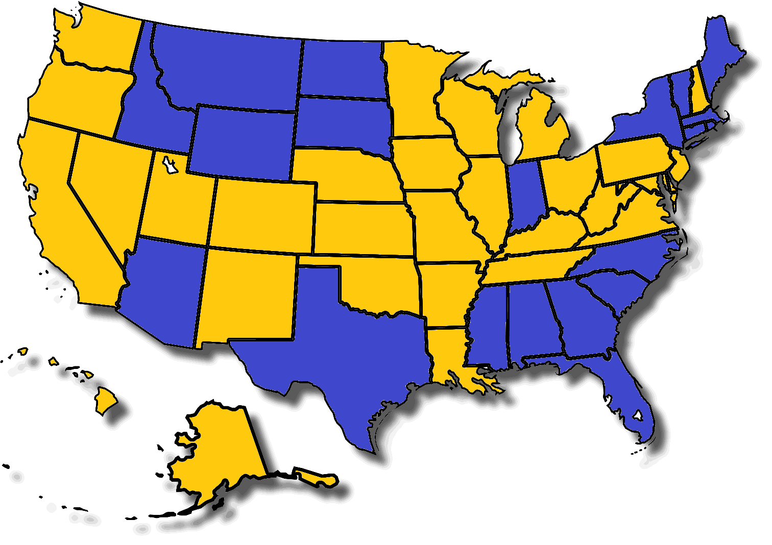
When did Memphis gain statehood?
What do the colors on this map mean?

If you wish to check your answer, or just what to know what the solution is, just scroll down.
.
.
.
.
.
.
.
And keep on scrollin’. . . .
.
.
.
.
Solution:
Of the other 49 states in the USA, how many are adjacent to this one? The answer to this question determines the color of each state.
One point of clarification: if it takes a lengthy trip by boat or ship to get there, I didn’t count it as an adjacent state . . . so, for example, Minnesota and Michigan didn’t make each other’s lists. Simply going over a bridge isn’t enough for this sort of separation, though, which is why Arkansas and Tennessee did make each others’ lists of adjacent states. Had I interpreted water borders differently, this map would have some differences.
Another way this map could be altered would be to count states that meet others only at a single point, rather than a border with non-zero length. This would change the colors of the “four corners” states of Arizona, Utah, New Mexico, and Colorado, but would have no effect on the other 46 states.
First, for puzzle #4a, what are the meanings of the colors on this map?
For puzzle #4b, what do the colors mean on this second, similar map?
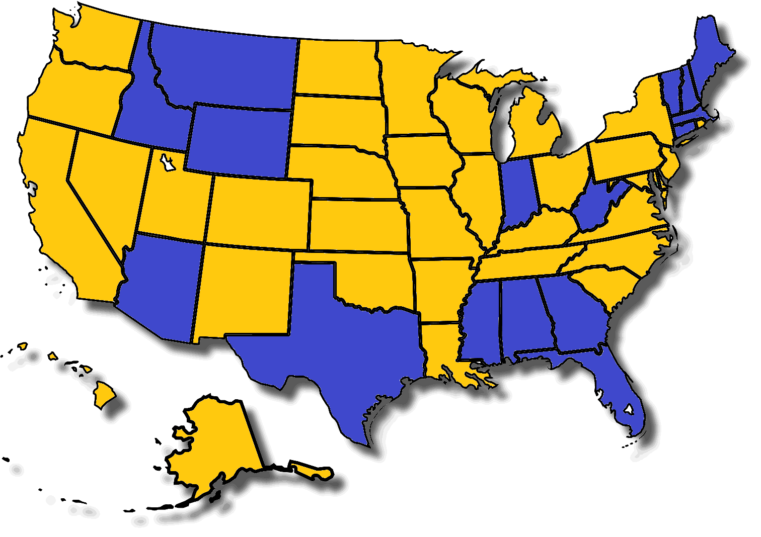
To find the answers, simply scroll down.
.
.
.
.
.
.
Keep scrolling….
.
.
.
.
.
Solution:
In the first map, consider the number of letters in the name of each state. Is this number prime or composite?
In the second map, consider the number of characters, rather than letters, in each state’s name. This number is different for states with two-word names, due to the single character, a blank space, needed to separate the two words. Again: prime, or composite?
What is represented by the colors on this map?
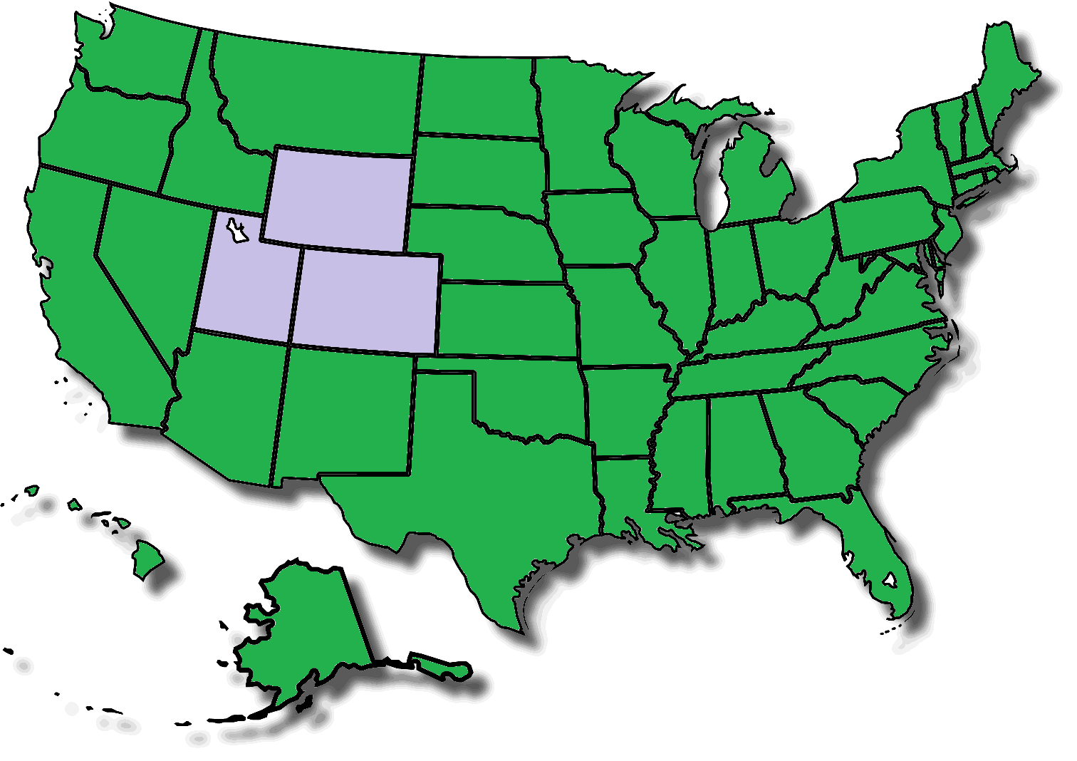
The answer may be found by scrolling down.
.
.
.
.
.
.
.
Keep scrolling….
.
.
.
.
Answer:
Do any of the borders of this state contain squiggles? (Note: if you think New Mexico is the wrong color, check the part of that state which borders El Paso, Texas.)
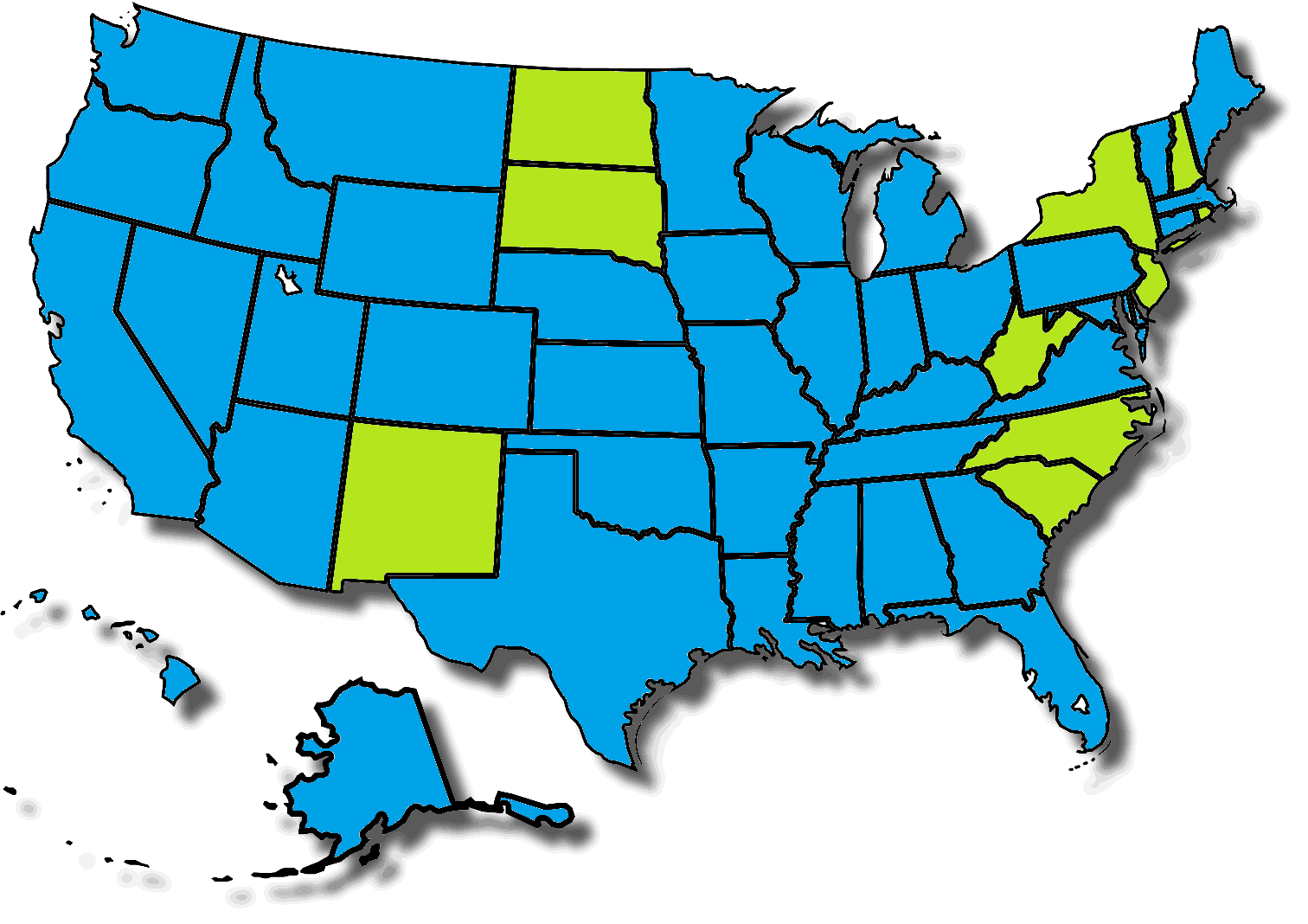
What is represented by the colors on this map?

If you give up, you can scroll down to find the answer.
.
.
.
.
.
.
Keep scrolling….
.
.
.
Answer: the colors show whether the name of each state starts with a letter in the first, or second, half of the alphabet.
What is represented by the colors on this map?
If you decide to give up, you can scroll down for the answer . . . but, I promise, the solution to this puzzle is extremely simple.
.
.
.
.
.
.
.
.
.
.
.
.
.
.
.
.
.
.
Keep scrolling, if you’re looking for the answer….
.
.
.
.
.
Answer:
The map shows how many words are in the name of each state.
I’ll start this analysis with a simple land/water breakdown for Earth’s surface:

The two figures in the chart above are familiar figures for many — but how does “land” break down into continents, and how does “water” break down into oceans, as fractions of Earth’s total surface area? That’s what this second chart shows.

With continents, I placed them on the chart to make it easier to see physically-connected continents as sets of adjacent wedges of similar color, separated only by thin lines. The most obvious example of this is Europe and Asia, which are considered separate continents in the first place only for historical reasons, not geographical ones. Combine them, into Eurasia, and it has 36.3% of Earth’s total land area, which is (36.3%)(0.292) = 10.6% of Eath’s total surface area. Even then, Earth’s three largest oceans (the Atlantic, Indian, and Pacific Oceans) are each larger than Eurasia.
There are other naturally-connected continents, albeit with much smaller land connections — narrow enough for humans to have altered this fact, only a “blip” ago on geographical time-scales, by building the Suez and Panama Canals. In the case of the Suez, its construction severed, artificially, the naturally-occurring land connection between Eurasia and Africa, and the term “Afro-Eurasia” has been used for the combination of all three traditionally-defined continents. Afro-Eurasia has 56.7% of Earth’s land, but that’s only (56.7%)(0.292) = 16.6% of Earth’s total surface area. That’s larger than the Indian Ocean, at (19.5%)(0.708) = 13.8% of Earth surface area. However, both the Atlantic Ocean, at (23.5%)(0.708) = 16.6% of Earth’s surface area, and the Pacific Ocean, at (46.6%)(0.708) = 33.0% of Earth’s surface area, are still larger than Afro-Eurasia.
The Pacific Ocean alone, in fact, has a greater surface area than all of Earth’s land — combined.
The other case that can be made for continent-unification involves North and South America, since their natural land connection was severed, only about a century ago, by the construction of the Panama Canal. Combine the two, and simply call the combination “the Americas,” and that’s 28.5% of earth’s land, which is (28.5%)(0.292) = 8.3% of Earth’s surface area. (I didn’t simply call this combination “America” to avoid confusion with the USA.) The Americas, even in combination, are not only smaller than each of Earth’s three largest oceans (the Atlantic, Indian, and Pacific), but also smaller than Afro-Eurasia, or Eurasia — or even Asia alone, by a narrow margin.
By the way, there are lots of things that don’t show up on the second chart above: islands, inland seas, lakes, rivers, etc., and there’s a good reason for that: on the scale of even the larger pie chart above, all these things are so small, compared to the oceans and continents, that they simply aren’t large enough to be visible.
This is a more detailed version of one of the earliest posts on this blog, “Places I Have Been.” In this version, I color-coded the states and provinces to show when I was last in each of these places (the color-coding is explained below the picture). Also, no, I haven’t left North America — yet — but visits to all the other continents on Earth, plus the Moon, are definitely on my lifetime “to do” list.

Here’s the color-key. It starts in the present, and then proceeds in reverse chronological order.
Red — I’m here right now. Arkansas is also the state where I have spent well over 90% of my life, and I was born here, as well, 47½ years ago (January, 1968).
Pink — These are states I’ve been to since turning 45, not counting where I am at the moment. It’s also the set of states my wife and I have visited together — so far.
Purple — I was last in each of these states during the first half of my forties.
Dark blue — I was last in Kansas in my thirties, flying there, with two other math teachers, for an educational conference.
Yellow — Louisiana is the only state which I last visited in my twenties.
Green — These are states I last visited at age nineteen. So far, that’s the furthest I have traveled in a single year. The green Mexican state on the map is Chihuahua, where I visited Cuidad Juárez, just across the Rio Grande from El Paso, Texas.
Light blue — These are the states and provinces I last visited as a “tween” (ages 10-12). The Northern vacation trip was with my family, and, so far, that’s the only time I’ve been to Canada. Virginia made the map when I won a trip to Washington, DC (too small to be seen above), as one of a busload of young newspaper carriers, for selling twenty newspaper subscriptions to Arkansas Gazette — one of America’s many “lost newspapers,” and one which I very much miss. Alabama and Florida are included because of a field trip, all the way to Key West, with a college class — one of the benefits of growing up as a “professor’s kid” who spent a lot of time on campus.
Brown — I have been to South Carolina once, but I wasn’t even close to ten years old at the time, and now I barely remember this family trip to the Atlantic coast.
Gray — I was so young, when my parents took me to Colorado, that I have no memories from that trip at all. I don’t think my younger sister had even been born yet, in fact. All I remember is being told, much later, that, yes, I have been to Colorado.
